Wondering how to craft a web application that captives user attention and drives conversations?
One of the essential elements that most businesses overlook while brainstorming web app development ideas is its user interface (UI) design that ultimately links to user experience (UX).
They tend to gravitate toward features rather than prioritizing the delivery of an impeccable user experience through intuitive web app design. That’s where they fail to grab user interest, resulting in poor user experience and increased bounce rate.
If you’re in the same boat, you need to revamp your strategy by focusing on building an engaging web app design that offers an interactive, engaging user experience using effective UI design strategies. Let’s get down to the nitty-gritty of discovering what web application design is.
Further, you’ll discover the top 8 web app UI design strategies with some of the best inspirational examples along with the steps involved in building modern web apps that inspire users.
Table of Content
- What is a Web Application Design?
-
8 Effective UI Design Strategies to Build Highly Engaging Web Applications
- Prioritize User-Centric Design
- Implement Intuitive Navigation Patterns
- Ensure Consistency in Branding and Visual Design
- Place Content in a Well-Organized Manner
- Adhere to Web Layout Best Practices
- Use Clear and Prominent Calls to Action (CTAs)
- Make Use of the Right Color Contrast and Accessible Colors
- Add Micro-interactions and Animations
- Step-by-Step Guide to Web Application Designing<
- Wrapping Up
What is a Web Application Design
Web app design is one of the most crucial steps in web app development, aiming towards captivating user interest and delivering impeccable user experience through the creation of a simple user interface design.
Simply put, you craft a web app design using a combination of various elements including, navigational and structural layout, information architecture, visual components, content presentation, and other interactive features.
Essentially, web app design is about mapping out a user's journey, helping them navigate the app smoothly to take the necessary steps to achieve a specific goal using your web app. Users are the top priority of web apps, making it essential for you to identify:
- Is your web app easy to interact with, or whether users find difficulties using it?
- How much time does a user take to perform a certain task or find the information?
- Does your web app design fulfill the target audience's needs and expectations?
- What visual elements, such as colors, fonts, and imagery, should be used to create an appealing web design?
- How can you provide a seamless and enjoyable user experience?
These questions can help guide and effectively overcome challenges in the design process. Additionally, it ensures that your web app design is interactive and easy to use while effectively meeting your user's needs.
8 Effective UI Design Strategies to Build Highly Engaging Web Applications
Let’s discover the hidden secret behind crafting a memorable web experience using 8 effective UI web design strategies that propel users toward leveraging your web app effortlessly, boosting conversions, and enhancing user satisfaction.
1. Prioritize User-Centric Design
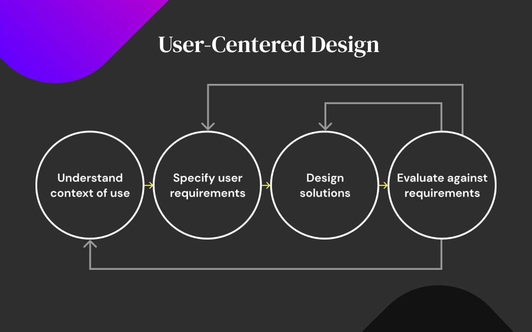
The first step when building a web app is to prioritize user-centric design. The concept revolves around crafting a web app by considering your end-user needs and preferences throughout the design process. Firstly, you understand the context of use, which involves gaining insights into the where, how, why, when, and under what conditions your web application will be used.
Secondly, you focus on identifying specific user requirements, including their goals, preferences, and pain points. In the next step, you create solutions that address these requirements, crafting interfaces and functionalities that are intuitive, accessible, and efficient.
Finally, you need to rigorously evaluate against the established requirements, often through user testing and feedback to ensure that the final product aligns with user expectations and enhances their experience. This iterative process enables continuous improvement and ensures that the web app resonates with its intended audience effectively.
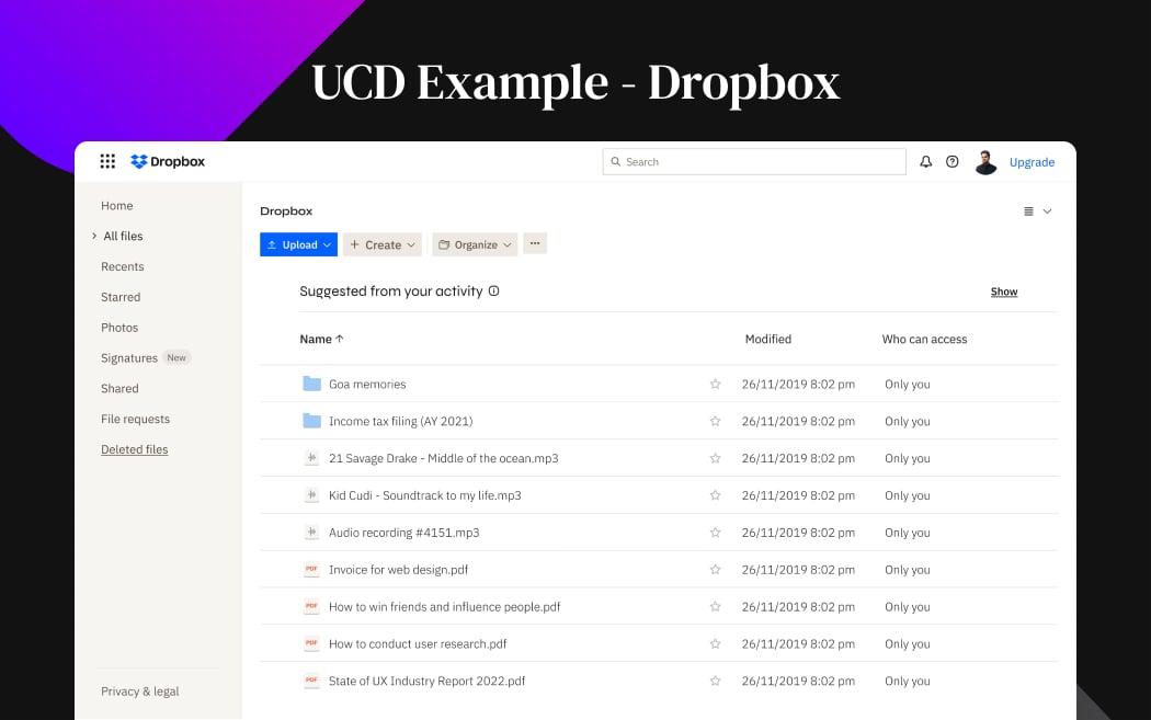
Example: Dropbox's web application is built around the needs of its users, focusing on simplicity, reliability, and collaboration. The platform offers seamless file syncing across devices, and easy uploading, sharing, and accessing with minimal effort. Additionally, Dropbox prioritizes user feedback and regularly updates its features and functionality to address user needs and preferences.
2. Implement Intuitive Navigation Patterns
Navigation patterns focus on the structure and layout of menus, buttons, and links to guide users from one page or section to another efficiently. However, businesses can build or customize the navigation patterns of their web app based on their user needs and preferences, individual user roles, and the informational hierarchy that helps users easily navigate and interact with the web app interface as seen in the example below.
When you utilize the right navigation patterns, it will help your users to easily explore and access their desired information and features more quickly. Additionally, you need to ensure the consistent placement of navigation elements across different pages of your web app to reduce cognitive load.
This means that users don’t get overwhelmed or confused while navigating your web app. It also facilitates a smoother and more enjoyable user experience, encouraging users to engage with your platform and achieve their goals efficiently.
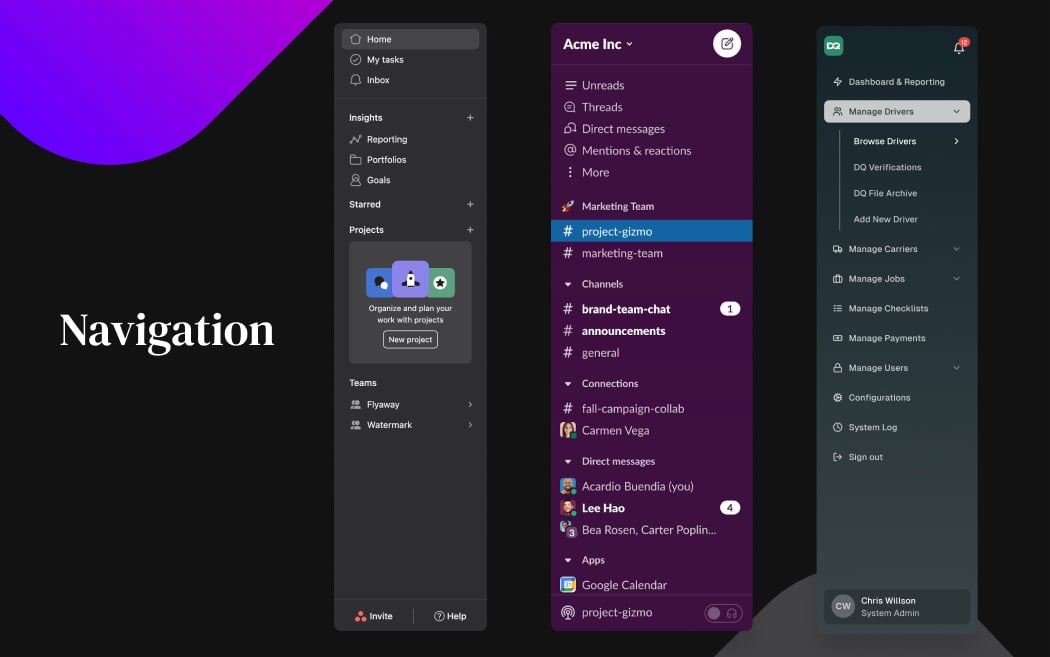
Example: Asana- a project management tool, encompasses a simple and intuitive navigation bar. Users can seamlessly navigate between projects, tasks, and conversations which helps them to easily collaborate with their team members and track their progress. Similarly, Slack enables you to customize the navigation bar with a wide range of options available to help you easily use and interact with your colleagues using its intuitive interface.
3. Ensure Consistency in Branding and Visual Design
Let’s imagine you design a web app for your brand and choose design elements, such as font style, color, images, and typography to represent your brand's unique identity. Unfortunately, you fail to deliver a consistent look and feel across pages and devices, resulting in a disjointed user experience and weakened brand recognition. Moreover, it also confuses users and decreases engagement as they struggle to navigate the inconsistent interface of your web app.
Here, it becomes crucial for you to utilize consistent design elements throughout the web app user interface to strengthen the brand image, communicate brand messaging, and enhance user recognition. It ultimately helps your users engage with your web app across devices effortlessly without requiring much effort in understanding your web app’s information hierarchy, organization, and functionality.
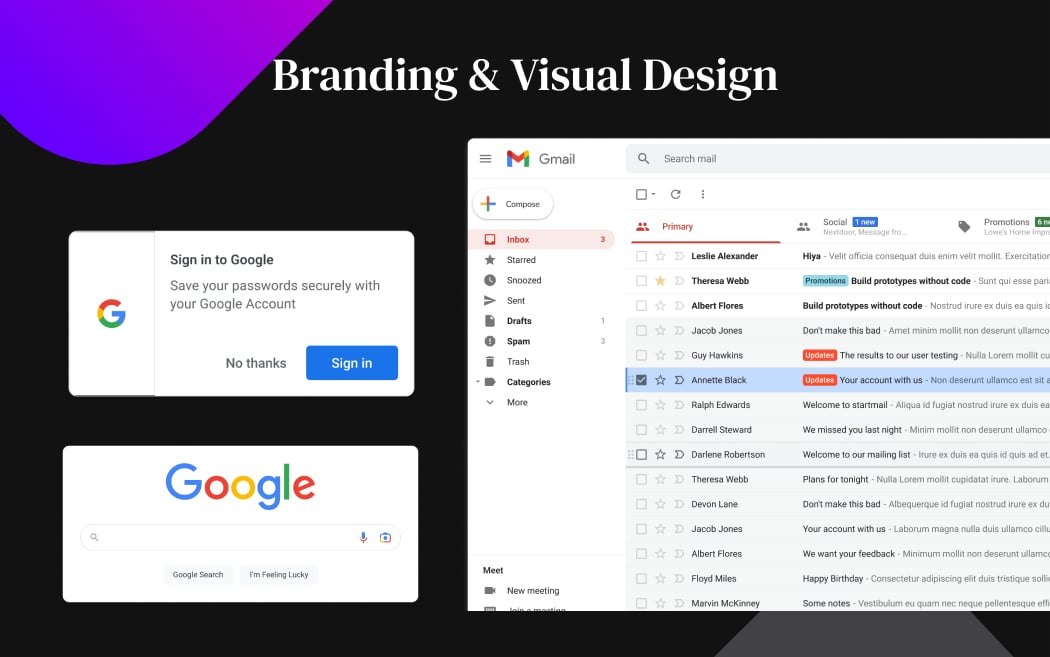
Example: Google is one of the leading examples that maintain visual consistency and branding across different devices. Although the desktop and mobile versions have different layouts, they use the same design elements and color combinations in their apps, enabling users to easily recognize and interact with Google's products regardless of the device they're using.
4. Place Content in a Well-Organized Manner
To deliver valuable and engaging content, it's important for you to carefully consider the placement and organization of the content intuitively. Collaborate with your design team to understand the information hierarchy and content placement, which typically means the seamless organization and categorization of the content based on its importance and relevance.
Thoughtfully label the placement of the buttons, text, images, and infographics that help users navigate the app and take necessary actions. Additionally, you need to ensure that your web app design will deliver and support the intended content and messaging. Most importantly, tailor the content to individual browsing preferences to achieve maximum conversions and sales.
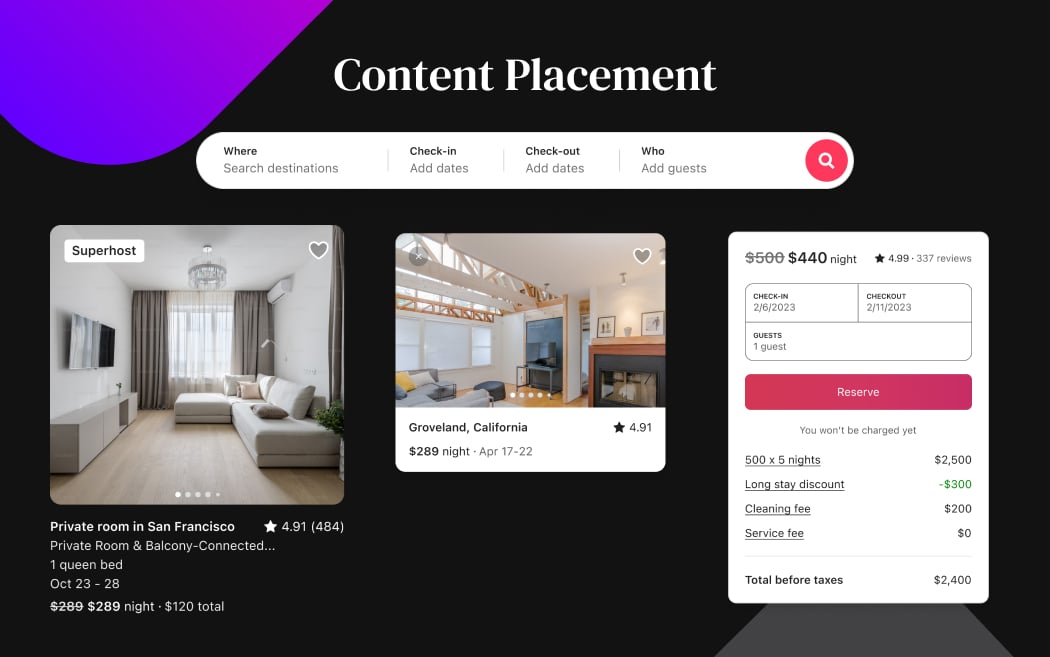
Example: Use wireframing and mockups that help you in planning and laying out the informational hierarchy and content placement. Airbnb showcases how you can grab user attention by visualizing content impressively and delivering targeted information to prompt user action.
5. Adhere to Web Layout Best Practices
You must adhere to web layout best practices to ensure your web app is user-friendly and adaptable to evolving trends and technology. A web layout assists you in arranging and organizing visual elements on your webpage, including components such, as headers, footers, sidebars, and content areas. It helps you improve the overall design structure and presentation of information within your web app.
Remember, the key to enhancing the overall web experience is to make it accessible, look modern, and most importantly easy to use with changing web app trends. For this purpose, you can implement and test various web layout patterns, including card-style layouts, split-screen Layouts, and magazine layouts.
Implement card-style layouts if you want to present the content in discrete, visually distinct "cards," each containing a piece of information or functionality. Split-screen layouts however are useful when you want to divide the screen into two or more sections to showcase contrasting content or functionalities side by side. Use magazine web layout to feature a combination of text and images with attention to hierarchy, whitespace, and visual flow to engage and guide users.
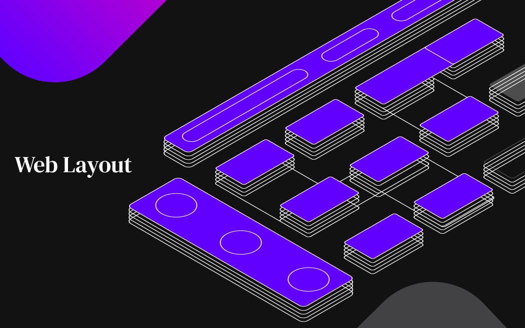
Example: Twitter's web application utilizes a card-based layout to display tweets, which improves the overall app usability and encourages users to Tweet with their friends and family with a simple and easy-to-use interface. MURAL is a digital workspace for visual collaboration that utilizes a split-screen layout, making it easier for users to collaborate on projects while simultaneously viewing and interacting with multiple elements of their canvas.
6. Use Clear and Prominent Calls to Action (CTAs)
Primary and secondary CTAs (Calls to Action) are key elements in guiding user interactions on a web application. The primary CTA is the main action you want users to take, typically aligned with the primary goal of the page. It's usually more prominent and encourages the most desired action, such as "Sign Up," "Buy Now," or "Get Started."
Secondary CTAs, on the other hand, are supplementary actions that support the primary CTA or provide alternative options. They are typically less emphasized but still important for user engagement, such as "Learn More," "View Plans," or "Contact Us."
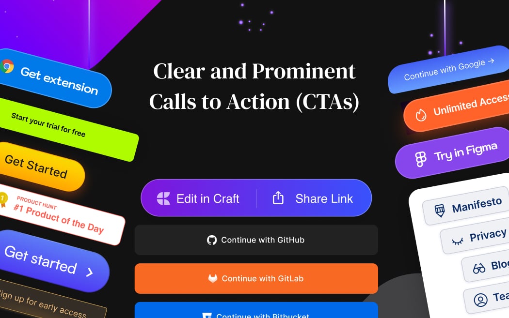
Example: Let’s say you are designing an e-commerce web app, you must use the primary CTA “Order Now” or "Add to Cart," to prompt the user to purchase the product and proceed to the checkout process. Likewise, you can use secondary CTAs, such as "View Product Details" or "Compare Products" to help users find more information and learn more about specific product features. These CTAs work together to guide users through the desired journey and encourage conversions.
7. Make Use of the Right Color Contrast and Accessible Colors
When designing a web application, you need to emphasize the importance of selecting colors that not only look visually appealing but also enhance the content readability and accessibility to all users. Mainly, color contrast refers to the difference in color between text and its background, which affects readability, especially for users with visual impairments.
Color accessibility, on the other hand, involves choosing colors that accommodate colorblind users and meet accessibility standards. Moreover, stick to the ADA (Americans with Disabilities Act) and WCAG (Web Content Accessibility Guidelines) guidelines when leveraging accessible colors.
Ultimately, you need to prioritize both color contrast and accessibility to foster an inclusive design environment where all users can engage with your web content comfortably and effectively.
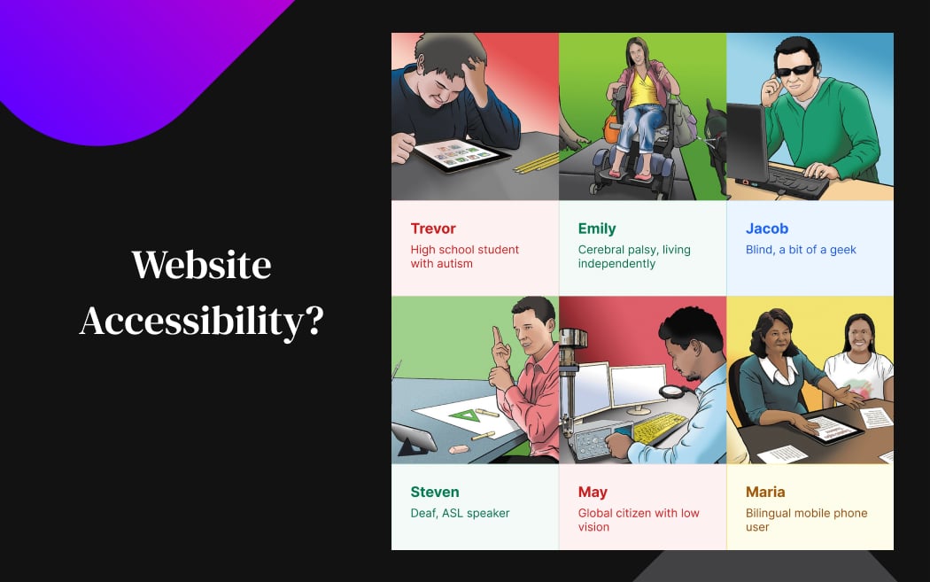
Example: Incorporate good color contrast and accessibility into your web app design by using high-contrast colors like black text on a white background or using color combinations that are distinguishable for colorblind users, such as using two main colors blue and red, along with shades made from these two hues. It may include a combination of blue/orange, blue/red, or blue/brown. By considering these factors, you create a more inclusive and user-friendly experience for all individuals interacting with your web app.
8. Add Micro-interactions and Animations
If you want to create an immersive, responsive, and visually appealing web application, use micro-interactions and animations. Micro-interactions are subtle, task-based animations that provide feedback, guide users, and enhance usability. They add depth, interactivity, and delight to the user experience to make interactions on your web app more engaging and enjoyable.
Animations such as transitions, hover effects, and loading indicators create fluidity and visual interest within the interface. By incorporating micro-interactions and animations within your web application, you deliver a highly engaging user experience that captivates users' attention.
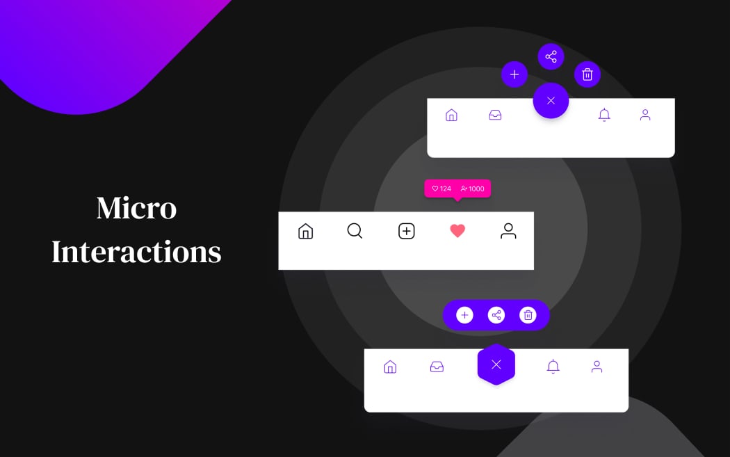
Example: Trello, a web-based project management application, utilizes micro-interactions to streamline task management. Users can drag and drop cards between lists, and subtle animations provide feedback to indicate the action's success. Furthermore, when opening cards to view details or add comments, the interface responds with smooth transitions and animations, making interactions feel seamless.
Step-by-Step Guide to Web Application Designing
Below, we’ve outlined the steps included in the overall process of web application designing.
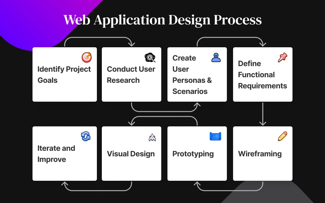
1. Identify Project Goals
The first step in your web app design is to identify your goals and objectives for building the web app design. Identify why you want to create, who is your target audience, what is your expectations, and what's the purpose of building a web app. Create a project brief that acts as a clear roadmap for you, your designers, and your stakeholders to stay on track and achieve desired outcomes. You can include the following in your design brief:
- Project goals and objectives
- Target audience preferences
- Key features
- Branding guidelines
- Specific design preferences
- Timeline and budget
- Key performance indicators (KPIs)
2. Conduct User Research
Once you've set clear goals, move towards conducting user research as it's crucial to understand your target audience's behavior and identify their needs and preferences. Pay attention to their pain points and challenges, and brainstorm how you can overcome them effectively in your web app design by conducting surveys, interviews, and usability tests. Ultimately, you can use this data to make data-driven design decisions and ensure a user-centered approach. Moreover, create an empathy map to bridge the understanding of your end user, including how they feel, behave, and interact.
3. Create User Personas and Scenarios
User personas are fictional representations of different user types, outlining their demographics, behaviors, and goals. These personas help you to craft scenarios that show realistic interactions of users with your web application. Mapping out scenarios plays an important role in outlining specific situations or tasks that users may encounter while using your web application. It’s a great strategy to understand your target audience's pain points and identify opportunities for improvement. Overall, using user personas and scenarios is essential to gain valuable insights into how to optimize your web app design to meet the diverse needs and preferences of your users effectively.
4. Define Functional Requirements
In this step, you outline the features of your web application that align with your user needs and business goals. These requirements detail functionalities like user authentication, content management, search functionality, and interactive web forms. They define how you interact with the web application and what outcomes to expect from those interactions. By clearly outlining functional requirements, you can effectively design and implement features aligned with your app's purpose to ultimately deliver the desired functionality and user experience.
5. Wireframing
After gathering functional requirements, you move towards creating basic blueprints well known as low-fidelity wireframes to sketch out the layout and structure of your web application. You can use rough paper to sketch out the wireframes without focusing on adding aesthetics or visual details. It helps you demonstrate what interface elements will exist on key pages. Additionally, you map out the user flow to illustrate the sequence of steps a user will take or follow to accomplish a specific task within your web application.
6. Prototyping
Finally, you move towards transforming the rough sketches you built in the previous step into high-fidelity prototypes using digital tools like Figma, Sketch, or Adobe XD. Prototypes are tangible interactive designs to map out the user flow and identify the placement and organization of interactive elements and the navigational layout of your web app. Additionally, it demonstrates how users would interact with your web app. Moreover, you also discover UI/UX issues, gain stakeholders’ feedback, and conduct usability testing before finalizing the design. It helps you to evaluate how user-friendly your web app is, whether it effectively addresses user needs, and identifies areas for improvement in the overall user experience.
7. Visual Design
Finally, you visualize your web app design by creating mockups that mimic the final look and feel of your web app. Add aesthetic details to your web app by seamlessly choosing a color scheme, typography, and visual elements that align with your brand identity. You can establish a strong brand presence and enhance user recognition by thoughtfully integrating these design elements. This stage of the design process enables you to refine details, ensure consistency, and create a polished user interface that resonates with your target audience, which ultimately reflects your brand identity and contributes to an engaging user experience.
8. Iterate and Improve
Now, you launch the web app to the market after you finalize the design and your backend developers code the functionality and features of your web app. Here, your potential customers use your web application to accomplish their goals and fulfill their needs. As they explore your web application, they interact with its features, navigate its interface, and engage with its content, delivering valuable feedback on how to iterate and improve. Iterating post-launch will help you respond to user feedback, address bugs or issues, and continuously enhance your user experience based on real-world usage. Moreover, this iterative approach enables you to adapt your web application design based on evolving user needs and design trends.
Wrapping Up
To attract visitors to your web app and captive their interest, businesses must craft modern, visually appealing web applications using effective UI design strategies, such as prioritizing user-centric design, implementing navigational patterns, using web layout best practices, making use of accessible colors, using clear and prominent CTAs, and adding micro-interactions explained in this blog post. Also, follow the step-by-step guide to web app designing that helps you build impressive yet functional web apps.
However, if you’re looking for modern web app design solutions, get in touch with Cygnis Media today. Our extensive portfolio showcases our ability to build highly engaging web applications for our clients across various industries that help them enhance their user experience, convert users into potential customers, and drive sustainable business outcomes.
So, what are you waiting for? Let’s build captivating web apps together that drive impactful outcomes, motivating users to act, respond, and engage in meaningful ways.


