In an era where digital experiences dominate our lives, Swiss web design stands out as a masterclass in clarity, functionality, and purpose. Rooted in a deep cultural heritage of precision and order, Swiss web design isn’t just a style—it’s a philosophy that transforms complex ideas into effortless digital interactions. When applied to web development, this approach prioritizes user experience, ensuring that every element of a website serves a clear function without unnecessary distractions.
The Roots of Swiss Design: A Historical Perspective

Swiss design finds its origins in the International Typographic Style of the 1940s and 1950s, shaped by pioneers like Josef Müller-Brockmann and Armin Hofmann. This movement was a response to earlier, more ornate design eras like Art Nouveau. Where Art Nouveau celebrated elaborate curves and organic forms, Swiss design stripped away the excess, leaving only the essentials.
The result? A focus on clarity, function, and balance—qualities that resonate deeply in today’s digital-first world. The typeface Helvetica, meaning "Swiss" in Latin, exemplifies this shift. Its clean lines and neutral appearance have made it a staple of web and graphic design, from corporate branding to subway maps. In modern design, a design system rooted in these principles ensures consistency and coherence across all platforms, offering a structured framework that aligns with user needs and enhances overall user experience.
The Three Pillars of Swiss Web Design
Swiss web design is built on three foundational principles that define its effectiveness and universal appeal.
1. Simple Layout: The Grid System Revolution
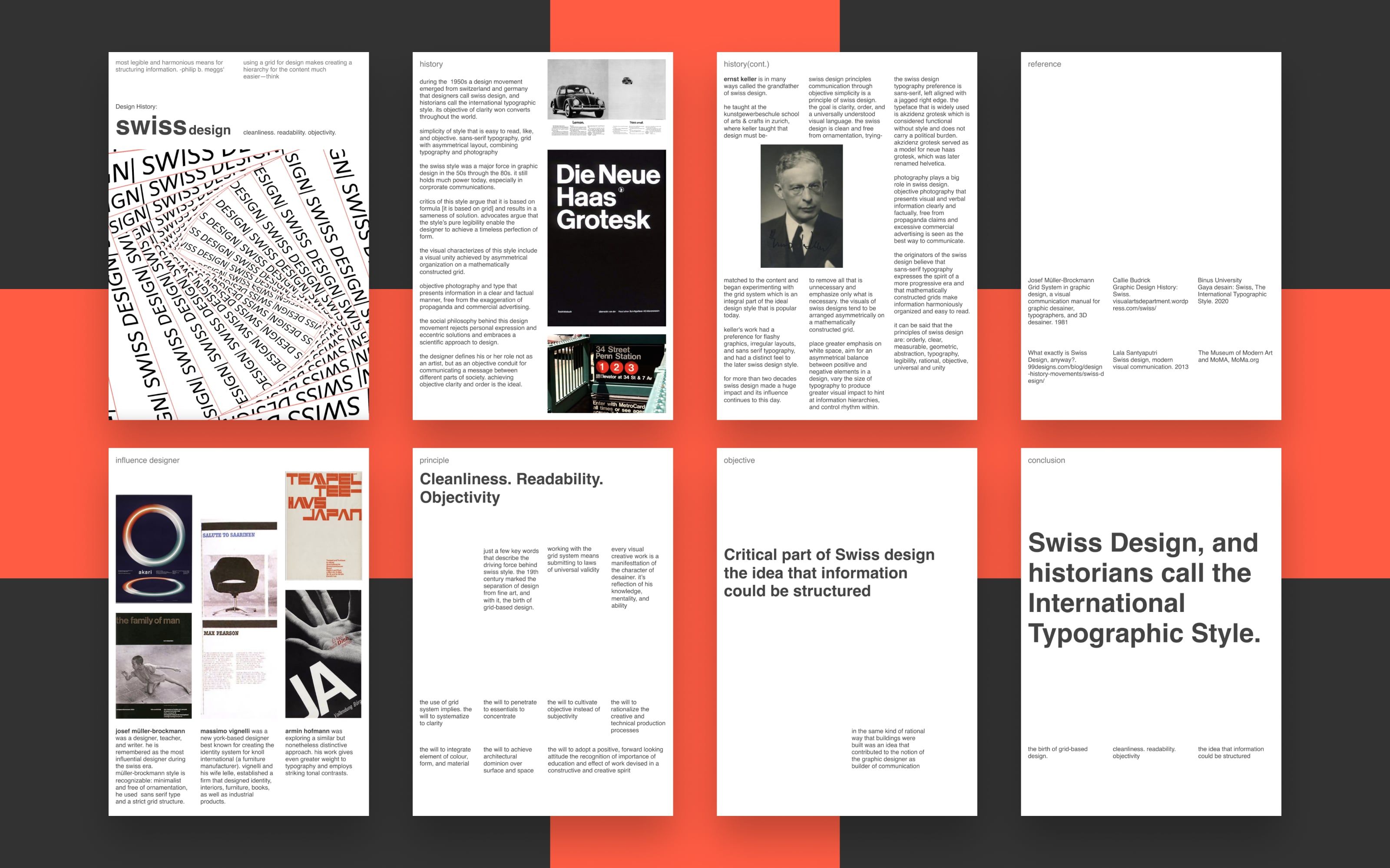
One of the most impactful contributions of Swiss web design is the grid system—a structured framework that organizes content with precision and balance. This approach doesn’t just create visually pleasing layouts; it provides a roadmap for the viewer’s eye, guiding attention to the most critical information.
Key Benefits:
- Enhanced readability: Structured layouts make text and images easier to digest.
- Consistent alignment: A uniform appearance across pages improves the user experience.
- Scalable flexibility: Grids allow designs to adapt seamlessly to different screen sizes.
2. Intuitive Navigation: Prioritizing User Logic
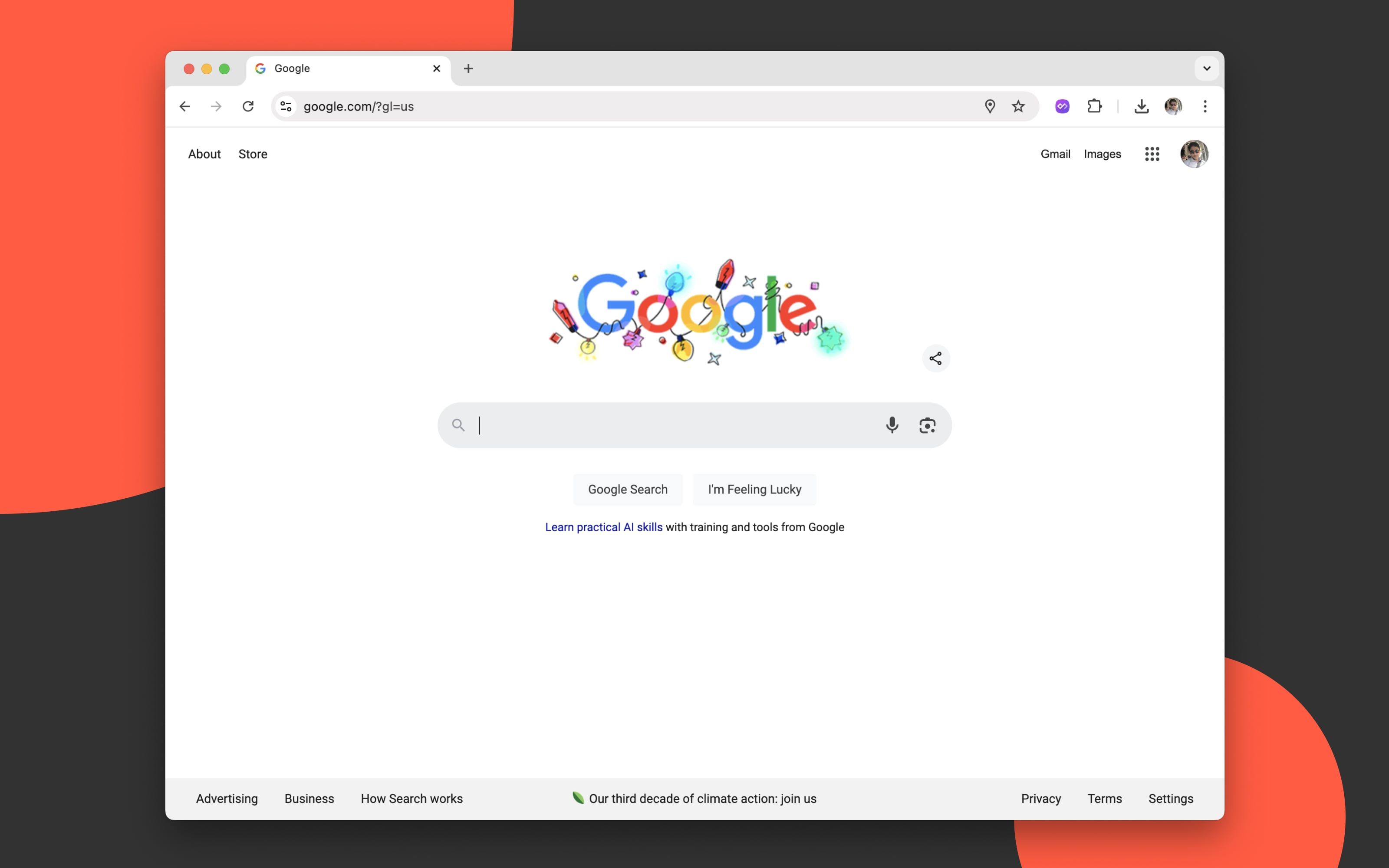
Think of Google’s search page. With a single input box and intuitive options, it’s a global symbol of no-nonsense navigation. In Swiss web design, navigation isn’t about flair—it’s about function. Therefore, it’s essential to avoid complicated navigation in web design by prioritizing simplicity. This allows users to seamlessly navigate your site without unnecessary distractions, ensuring that they can quickly find what they need. The mantra "less is more" ensures that navigation elements are pared down to essentials.
Practical Implementations:
- Minimalist menus: Focus on concise categories.
- Descriptive labels: Reduce ambiguity by clearly stating the purpose of each link.
- Predictable patterns: Use familiar layouts that users intuitively understand.
3. Efficiency: Designing for Speed and Functionality

The minimalist design of apps like Notion reflects Swiss principles by delivering tools that prioritize usability over decoration. Efficiency is ingrained in Swiss culture, from their punctual trains to their precise engineering. This philosophy is seamlessly translated into engaging web design, where the goal is to eliminate unnecessary steps and reduce cognitive load.
Applications in Design:
- Fast-loading pages: Optimize assets to minimize delays.
- Clear call-to-action (CTA) buttons: Guide users to desired actions without distraction.
- Responsive designs: Adapt fluidly to any device, ensuring usability across platforms.
Swiss Design in Action: Real-World Examples
Swiss design principles have revolutionized how digital experiences are created, emphasizing clarity, simplicity, and functionality. Let’s delve deeper into how these principles have been implemented in three globally recognized platforms—Apple, Medium, and IKEA.
1. Apple: A Symphony of White Space and Functionality
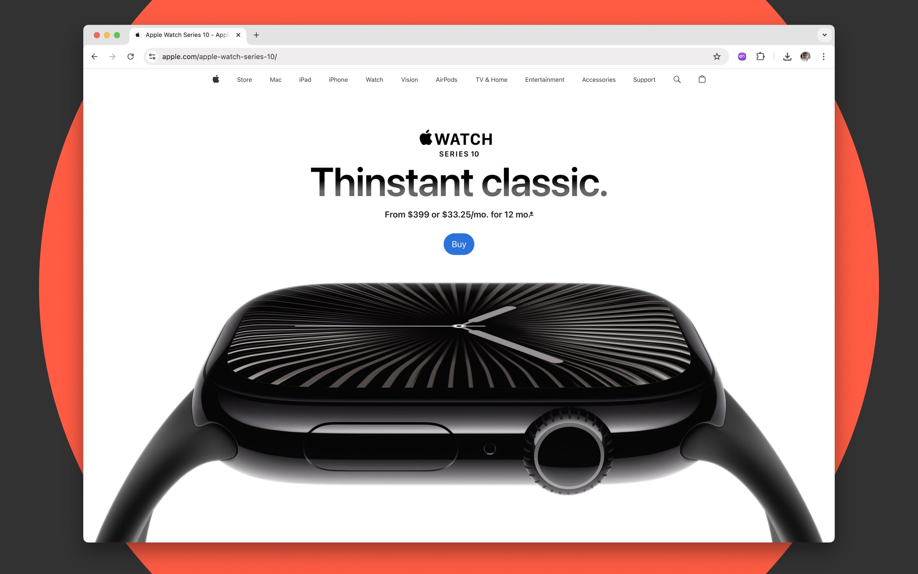
Apple's website epitomizes the principles of Swiss design, combining clean aesthetics with an intuitive user experience.
- Generous White Space: The strategic use of white space helps content "breathe," drawing attention to key elements like product visuals and CTAs. For instance, on product pages like the iPhone, the white space around the device enhances focus and creates a premium, uncluttered feel.
- Typography: Apple’s reliance on minimalist sans-serif fonts such as San Francisco ensures content is highly readable and modern. Headlines are bold and purposeful, while supporting text is concise, reflecting Swiss design's precision.
- Navigation: Apple’s navigation menu is simple and hierarchical. It features clear labels—“Mac,” “iPhone,” “iPad”—that users can intuitively understand, aligning with Swiss design's philosophy of reducing cognitive load.
- Grid-Based Layout: The layout of Apple’s product pages is meticulously grid-based, ensuring visual harmony while guiding users through a logical flow of information—from showcasing product features to encouraging purchases.
By adhering to these principles, Apple has created a digital experience that mirrors its physical products: sleek, user-friendly, and visually stunning web applications.
2. Medium: Prioritizing Readability and Content Hierarchy

Medium, a popular blogging platform, is another outstanding example of Swiss design’s influence, particularly in how it enhances content delivery and readability.
- Grid System: Medium uses a grid layout to display blog posts, ensuring visual consistency across its pages. The platform employs fixed column widths and balanced margins, which help maintain structure while adapting seamlessly to different screen sizes.
- Simple Fonts: Medium relies on fonts like Charter and Graphik, which strike a perfect balance between readability and sophistication. The ample line spacing and consistent font sizes ensure users can consume long-form content without strain.
- Focus on Content: Medium’s design minimizes distractions. There are no excessive sidebars or ornamental visuals, allowing users to focus solely on the written content. This aligns with Swiss design's ethos of purpose-driven simplicity.
- Responsive Design: Medium’s responsive approach ensures that users on mobile devices experience the same clarity and structure as those on desktops. The adaptability of the grid system and typography maintains harmony across platforms.
By prioritizing responsive web design, and emphasizing readability and content prioritization, Medium delivers an exceptional user experience that is both functional and elegant, making it a preferred platform for writers and readers alike.
3. IKEA: Seamless Navigation Meets Visual Harmony
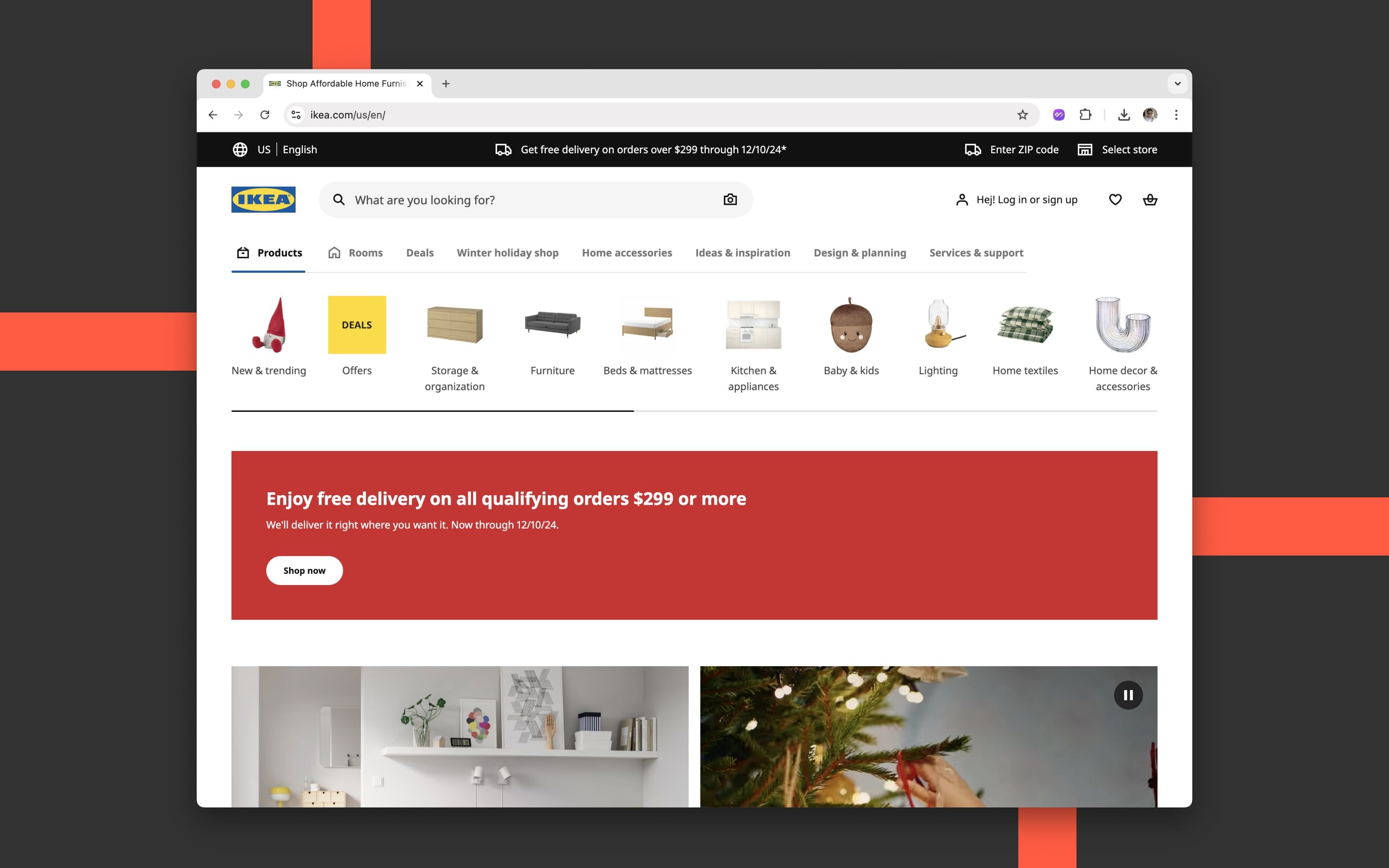
IKEA’s website blends Swiss design principles with its own brand identity, offering users an efficient and aesthetically pleasing shopping experience.
- Functional Navigation: The navigation menu is straightforward, with clear categories like “Living Room,” “Bedroom,” and “Kitchen.” The dropdown menus expand with additional options, allowing users to drill down to specific products effortlessly. This intuitive approach reduces the need for excessive clicks, improving user satisfaction.
- Clean Aesthetics: IKEA employs generous white space, subtle color palettes, and large product images to create a calming and organized browsing experience. The visual hierarchy is evident in the placement of CTAs, product prices, and descriptions, ensuring users can quickly find what they’re looking for.
- Typography and Labels: IKEA uses simple sans-serif fonts that echo the practicality of Swiss design. Descriptive labels and clearly defined sections further enhance usability, reducing any guesswork for shoppers.
- Mobile Optimization: On mobile devices, IKEA’s grid-based layout adapts perfectly, displaying products in a clean, scrollable format. The search functionality and filters are prominently placed, streamlining the process of finding items.
- Problem-Solving Design: For complex tasks like room planning, IKEA offers tools that integrate seamlessly into its site. These tools adhere to Swiss design principles by presenting options in a step-by-step, visually clean manner, reducing overwhelm for users.
IKEA’s digital presence reflects its broader brand values—functionality, accessibility, and a commitment to solving user needs—underscored by the timeless principles of Swiss design.
Conclusion:
Swiss web design is a revolution of simplicity and purpose. It strips away the noise, emphasizing user needs, functional beauty, and efficient interaction. Whether you're designing for an app, a website, or a digital product, embracing Swiss principles can elevate your work, creating experiences that are both timeless and transformative.


